
Trend Breakdown Visual
Compare groups and emphasize the magnitude of change over time.
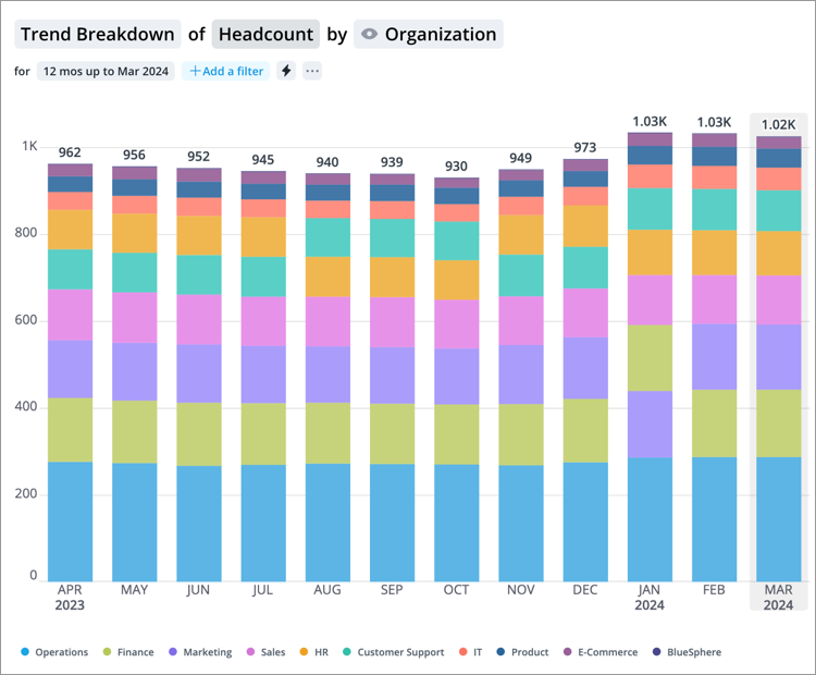
The Trend Breakdown visual is a bar chart plotted over time. The length of each bar is proportional to the value of the metric at a point in time. Metric values are visualized starting from zero to emphasize absolute magnitude. If a group by attribute is selected, the chart turns into a stacked bar chart where each bar is divided into segments that represent different parts of the whole. The bar segments are determined by the selected group by attribute. For example, in a Trend Breakdown of Headcount grouped by Organization, the bar segments represent the headcount for each organization. The overall score is the total value of all the segments added together.
Note:
- By default, the Trend Breakdown appears as a stacked bar chart.
-
The stacked bar chart is only available for additive metrics whose values for different populations can be summed to calculate a total value for the combined population.
- Headcount is an additive metric because you can add the headcounts of Group A and Group B to calculate a total.
- Resignation rate is not an additive metric because you cannot add the resignation rates of Group A and Group B to calculate a total.
-
The stacked bar chart does not support a mix of positive and negative values. The visual will not display if the selected attributes produce stacked bars that contain positive and negative segments.
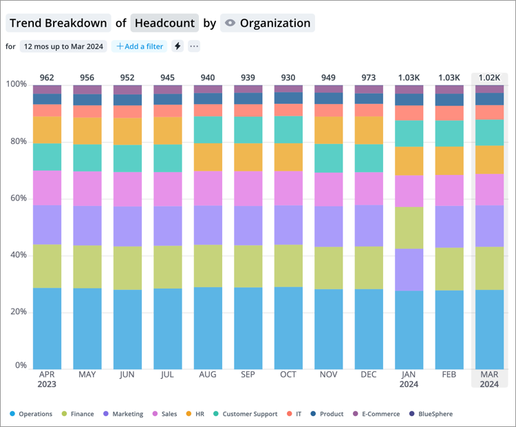
If you want to see the proportional differences between each group over time, you can use a 100% stacked bar chart. In this chart all the bars are equal to 100 percent and the segments represent the contribution of the group by to the overall score. For example, in the Breakdown of Headcount grouped by Organization, the bar segments show the percentage contribution of each organization to the overall score.
Use the visual to compare groups and when you want to emphasize the magnitude of change over time.
How to explore the visual to gain insight
- Explore data points of interest and view a summary of the data in the Info panel by clicking a bar segment.
- View the proportional differences between each group by changing the stacked bar chart to a 100% stacked bar. Click the Settings button
 on the Visual Actions menu and then click 100% stacked bar under Breakdown options.
 -
Add an event annotation to mark important dates on your visual by clicking the Annotate button
 on the Visual Actions menu. For more information, see Add an Annotation.
Tip:
-
Right-click on a chart item or data point to open the Visual Item Actions menu. Find actions that will allow you to quickly interact with points of interest. Actions include drilling up or down to view different levels of your data and accessing the Detailed View visual to see a list of subject members or event occurrences that make up a given population.
-
By default, zeros, null (N/A) values, and the Others data item are hidden.
-
To change the default settings, click your User icon
 > Preferences > Charts.
Add traffic lighting rules
You can also highlight metric performance by applying traffic colors to the visual. For more information, see Traffic Lighting and Add Traffic Lighting Rules.